Examining Aphex Twin's Eclectic Discography With the Spotify API and Generalized Variance

This week was the week of April 14th, the date that shares the (French) name of Aphex Twin’s most well-known work, “Avril 14th.” I have known about Aphex Twin since maybe middle school or so, but I only first really listened in earnest after hearing “Avril 14th” as the backing track to the poignant ending scene of the black comedy Four Lions. And then, of course, it was sampled in Kanye West’s “Blame Game.”

His discography has always been very hit-or-miss for me. I love the pretty piano, ambient, and down-tempo works. But I’m less a fan of the glitchy, fast-paced tracks; I’m much more into the “Flim” side of his discography than the “Phloam” side.

Aphex Twin strikes me as an artist who has an exceptionally eclectic discography, one where you wouldn’t think would contain both calming, ambient works and anxious, erratic ones.

I wanted to see if this discography was really more varied than comparable artists. The Spotify API allows developers to grab metrics about songs, including three that range from 0 to 1:

  • Danceability: “how suitable a track is for dancing based on a combination of musical elements including tempo, rhythm stability, beat strength, and overall regularity”

  • Energy: “a perceptual measure of intensity and activity. Typically, energetic tracks feel fast, loud, and noisy… attribute include dynamic range, perceived loudness, timbre, onset rate, and general entropy”

  • Valence: “describing the musical positiveness conveyed by a track. Tracks with high valence sound more positive (e.g. happy, cheerful, euphoric), while tracks with low valence sound more negative (e.g. sad, depressed, angry).”

My thinking being that Aphex Twin’s discography would have an exceptionally high variance on these three latent dimensions.

Getting the Data

I used the handy {spotifyr} package to access the Spotify API. I defined a helper function to get artists related to Aphex Twin. This function wrapped around the spotifyr::get_related_artists() function to do the following:

  1. Initialize a list of related artists by getting the 20 artists related most to Aphex Twin (as indicated by listener behavior).

  2. For each of those 20 artists, get their 20 related artists. Bind these data to the initialized data in Step 1. Deduplicate so that no artists are listed twice.

  3. Get the 20 related artists for each of the artists in the remaining dataset resulting after Step 2. Dedupe.

  4. Do it one last time: Get the 20 related artists for each of the artists after Step 3. Dedupe.

The function looks like:

get_related_recursive <- function(id, iter) {
  out <- get_related_artists(id)
  done_iter <- 0
  while (done_iter < iter) {
    tmp <- unique(do.call(bind_rows, lapply(out$id, get_related_artists)))
    out <- unique(bind_rows(out, tmp))
    done_iter <- done_iter + 1
  }
  return(out)
}

Where id is the Spotify artist ID and iter is how many iterations one wants to do after the initial grab of related artists. Full code for getting all of the data can be found at the end of this post. This returned thousands of artists, and I only considered those that had more than 80,000 followers. This resulted in 329 artists. For each artist, I grabbed the audio features for every one of their songs. Three artists didn’t parse, resulting in 326 artists to look at.

Choosing a Metric

My hypothesis is that Aphex Twin has an especially eclectic discography. In statistical terms, we could characterize this as the characteristics of his discography vary more than other artists’. So we want to look at each artist’s discography and see how those variables mentioned above—danceability, energy, and valence—vary. We need a measure of multivariate spread or dispersion.

When looking at just one variable, the answer is straightforward: We can look at the variance for each artist to characterize how much spread there is in the distribution of songs. This would be a good enough metric for our uses, since all songs are measured on the same 0 to 1 scale.

But we want to look at three variables. Summing up the variances of each of the three variables sounds appealing, but there’s a problem: What if two of the variables are highly correlated? Imagine two situations where two variables are plotted against one another, one situation where the variables are completely uncorrelated (left panel) and one where they correlate highly (right panel).

library(tidyverse)
library(mvtnorm)
set.seed(1839)

rmvnorm(100, sigma = matrix(c(1, .8, .8, 1), 2)) %>% 
  rbind(rmvnorm(100, sigma = matrix(c(1, .0, .0, 1), 2))) %>% 
  as.data.frame() %>% 
  mutate(r = rep(c("r = .8", "r = .0"), each = 100)) %>% 
  ggplot(aes(x = V1, y = V2)) +
  geom_point() +
  facet_wrap(~ r) +
  ggthemes::theme_fivethirtyeight(16)
sim-1

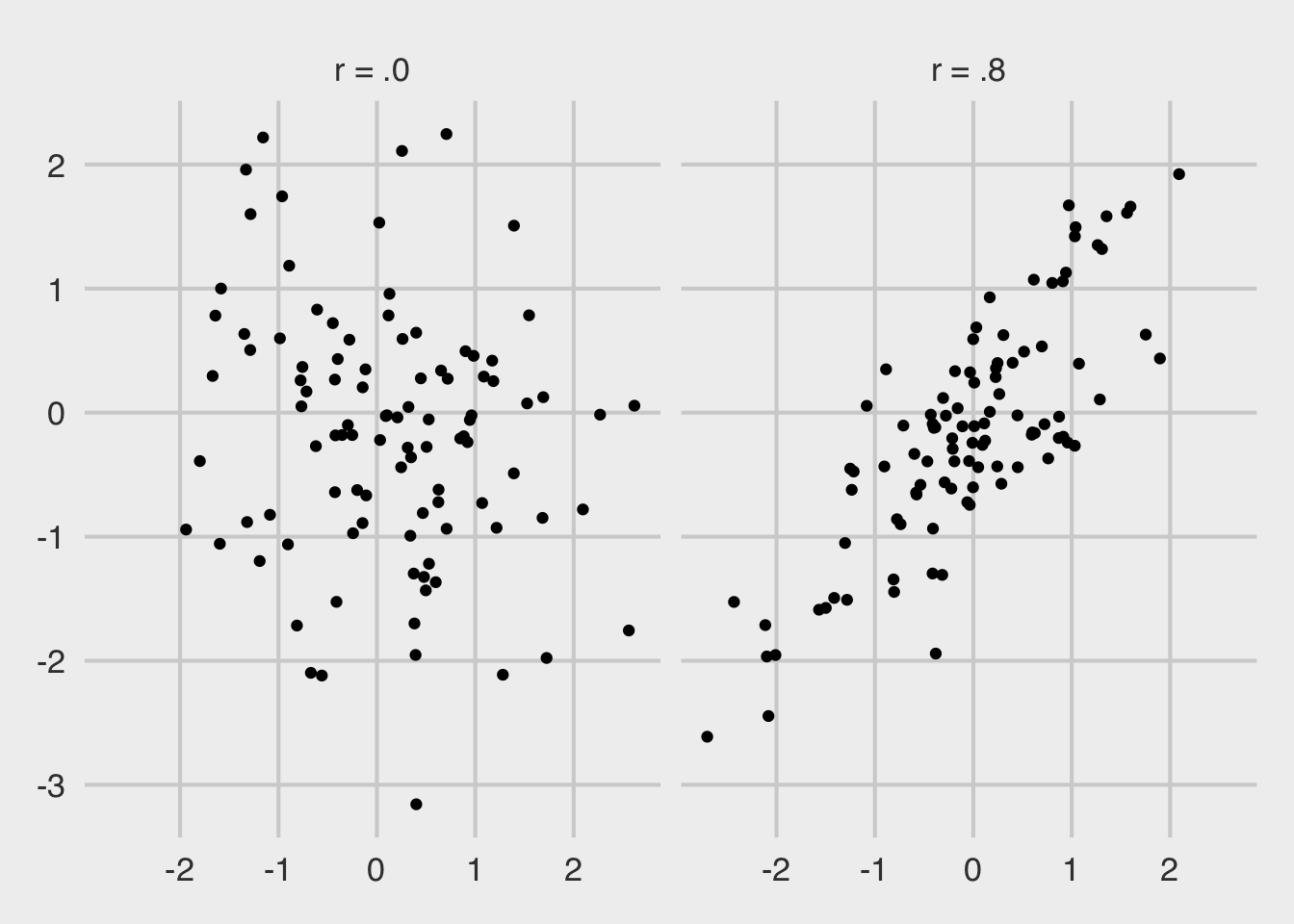
We can see that the uncorrelated points take up more space—they are more dispersed. We want a metric that appreciates this. Think of it this way: Since each of the three metrics from Spotify are on a 0 to 1 scale, imagine a cube where each of the sides has a length of 1. In one corner of the box is a point representing a song that is high in energy, valence, and danceability. Another corner has songs where the danceability is high, valence is high, but energy is low. And so on.

I am considering an eclectic catalog of songs to be one that has points all over this cube. The determinant of the covariance matrix can do that for us, which is sometimes known as “generalized variance,” see Wilks (1932) and Sen Gupta (2006).

Analysis

A highly-eclectic, varied discography of songs is thus one with a large generalized variance. For each of the artists, I got the generalized variance across all of their songs on Spotify, using the following code:

dat <- read_csv("aphex_twin_related_features.csv")

gen_var <- sapply(unique(dat$artist_name), function(x) {
  dat %>% 
    filter(artist_name == x) %>% 
    select(danceability, energy, valence) %>% 
    cov() %>% 
    det()
})

And we can plot the top 30 artists, similar-ish to Aphex Twin, that have the most generalized variance.

tibble(artist_name = unique(dat$artist_name), gen_var) %>%
  top_n(30, gen_var) %>% 
  arrange(gen_var) %>% 
  mutate(artist_name = factor(artist_name, artist_name)) %>% 
  ggplot(aes(x = artist_name, y = gen_var)) +
  geom_bar(stat = "identity", fill = "#4B0082") +
  coord_flip() +
  labs(title = "Most Varied Discographies", 
       subtitle = "Of popular artists similar to Aphex Twin",
       x = "Artist", y = "Generalized Variance", 
       caption = "@markhw_") +
  ggthemes::theme_fivethirtyeight() +
  theme(axis.title = element_text())
plot-1.png

Aphex Twin, by a wide margin, has the most varied Spotify discography in terms of danceability, energy, and valence. This is of a sample of popular, comparable artists—those that people who listen to Aphex Twin also listen to. Some other great artists are on here, as well: Boards of Canada, Four Tet, Thom Yorke, RJD2, Broken Social Scene, Flying Lotus.

You can see all the data and code for this post by going to my GitHub.

Code for Grabbing Data

# get data ---------------------------------------------------------------------
library(tidyverse)
library(spotifyr)

get_related_recursive <- function(id, iter) {
  out <- get_related_artists(id)
  done_iter <- 0
  while (done_iter < iter) {
    tmp <- unique(do.call(bind_rows, lapply(out$id, get_related_artists)))
    out <- unique(bind_rows(out, tmp))
    done_iter <- done_iter + 1
  }
  return(out)
}

dat <- get_related_recursive("6kBDZFXuLrZgHnvmPu9NsG", 3)

dat <- dat %>% 
  filter(followers.total >= 80000) %>% 
  select_if(function(x) !is.list(x))

write_csv(dat, "aphex_twin_related.csv")

dat2 <- lapply(dat$name, function(x) {
  cat(x, "\n")
  tryCatch(
    get_artist_audio_features(x),
    error = function(x) return(NA)
  )
})

dat2 <- lapply(dat2, function(x) {
  if (is.data.frame(x)) {
    x %>% 
      select_if(function(x) !is.list(x))
  } else {
    NA
  }
})

dat2 <- dat2[!is.na(dat2)] %>% # 3 artists failed to parse
  do.call(bind_rows, .)

write_csv(dat2, "aphex_twin_related_features.csv")

"Ode to Viceroy": Mac DeMarco's Influence on Interest in Viceroy Cigarettes

Mac DeMarco released his first album, 2, on October 16th, 2012. The fifth track is called “Ode to Viceroy,” which is a song about the Viceroy brand cigarette. He’s gained in popularity with his subsequent releaes, Salad Days and This Old Dog, and his affection for cigarettes had turned into somewhat of a meme.


What has the effect of “Ode to Viceroy” been on the popularity of the Viceroy brand itself?

I looked at this question by analyzing frequency of Google searches (accessed via the gtrendsR R package) using the CausalImpact R package.

I pulled the frequency of Google searches for a number of cigarette brands. I went looking around Wikipedia and found that Viceroy is owned by the R. J. Reynolds Tobacco Company. This sentence was on that company’s Wikipedia page: “Brands still manufactured but no longer receiving significant marketing support include Barclay, Belair, Capri, Carlton, GPC, Lucky Strike, Misty, Monarch, More, Now, Tareyton, Vantage, and Viceroy.”

I took each of these brand names and attached “cigarettes” to the end of the query (e.g., “GPC cigarettes”). I didn’t use “More,” due to the majority of queries for “More cigarettes” was probably not in reference to the More brand. I pulled monthly search numbers for each of these brands from Google Trends. I set the date range to be four years before (October 16th, 2008) and after (October 16th, 2016) 2 came out.

The CausalImpact package employs Bayesian structural time-series models in a counterfactual framework to estimate the effect of an intervention. In this case, the “intervention” is Mac DeMarco releasing 2. Basically, the model asks the question: “What would have the data looked like if no intervention had taken place?” In the present case, the model uses information I gave it from Google Trends about the handful of cigarette brands, and then it estimates search trends for Viceroy if 2 had never been released. It then compares this “synthetic” data against what we actually observed. The difference is the estimated "causal impact" of Mac DeMarco on the popularity of Viceroy cigarettes. (I highly suggest reading the paper, written by some folks at Google, introducing this method.)

When doing these analyses, we assume two crucial things: First, that none of the other brands were affected by Mac DeMarco releasing 2; and Second, that the relationships between the other brands and Viceroy remained the same after the album’s release as before the release.

Google Trends norms their data and scales it in a way that isn’t readily interpretable. For any trend that you retrieve, the highest amount of searches is set to the value of 100. Every other amount is scaled to that: If you observe a 50 for one month, that means it is 50% the value of the number of searches observed at the max in that time period. Keep this in mind when looking at the results.

You can see the trend below. The black line is what we actually observed for the amount of Google queries for “Viceroy cigarettes.” The dashed vertical line represents when Mac released 2. The dashed blue line is what we estimate would have been the trend if Mac hadn’t ever released his album, and the lighter blue area above and below this line represents our uncertainty in this dashed blue line. Specifically, there is 95% probability that the dashed blue line is somewhere in that light blue range.

We can see that what we actually observed goes outside of this blue range about a year after Mac released his album. According to the model, there is greater than a 99.97% probability that Mac DeMarco had a positive effect on people Googling “Viceroy cigarettes”. On average, the difference between what we actually observed and the estimated trend if Mac didn’t release 2 was 31, and there’s a 95% probability that this difference is between 27 and 35. This number is a little hard to interpret (given how the data are normed and scaled), but one could say that the estimated causal impact—for the average month in the four years after Mac's first album—is about 31% of whatever the highest observed number of monthly search queries were for “Viceroy cigarettes” in this same time.

But how do we know this is due to Mac? We can't ever be 100% sure, but if you look at Google Trends for "Viceroy cigarettes" in the four years after he released his album, the top "related query" is "Mac DeMarco."

In one song, Mac DeMarco was able to get people more interested in Viceroy cigarettes. I’m interested in how this affected sales—I’d bet there is at least some relationship between Google searches and sales.

Code for all data collection and analyses is available on my GitHub.

Sentiment Analysis of Kanye West's Discography

Introduction

Last time, I did some basic frequency analyses of Kanye West lyrics. I've been using the tidytext package at work a lot recently, and I thought I would apply some of the package's sentiment dictionaries to the Kanye West corpus I have already made (discussed here). The corpus is not big enough to do the analyses by song or by a very specific emotion (such as joy), so I will stick to tracking positive and negative sentiment of Kanye's lyrical content over the course of his career.

Method

For each song, I removed duplicate words (for reasons like so that the song “Amazing” doesn't have an undue influence on the analyses, given that he says “amazing"—a positive word—about 50 times). I allowed duplicate words from the same album, but not from the same song.

The tidytext package includes three different sentiment analysis dictionaries. One of the dictionaries assigns each word a score from -5 (very negative) to +5 (very positive). Using this dictionary, I simply took the average score for the album:

afinn <- kanye %>% # starting with full data set
  unnest_tokens(word, lyrics) %>% # what was long string of text, now becomes one word per row
  inner_join(get_sentiments("afinn"), by="word") %>% # joining sentiments with these words
  group_by(song) %>%  # grouping dataset by song
  subset(!duplicated(word)) %>% # dropping duplicates (by song, since we are grouped by song)
  ungroup() %>% # ungrouping real quick...
  group_by(album) %>% # and now grouping by album
  mutate(sentiment=mean(score)) %>%  # getting mean by album
  slice(1) %>% # taking one row per every album
  ungroup() %>% # ungrouping
  subset(select=c(album,sentiment)) # only including the album and sentiment columns

The other two dictionaries tag each word as negative or positive. For these, I tallied up how many positive and negative words were being used per album and subtracted the negative count from the positive count:

bing <- kanye %>% # taking data set
  unnest_tokens(word, lyrics) %>% # making long list of lyrics into one word per row
  inner_join(get_sentiments("bing"), by="word") %>% # joining words with sentiment
  group_by(song) %>% # grouping by song
  subset(!duplicated(word)) %>% # getting rid of duplicated words (within each song)
  ungroup() %>% # ungrouping
  count(album, sentiment) %>% # counting up negative and positive sentiments per album
  spread(sentiment, n, fill=0) %>% # putting negative and positive into different columns
  mutate(sentiment=positive-negative) # subtracting negative from positive

# all of this is same as above, but with a different dictionary
nrc <- kanye %>% 
  unnest_tokens(word, lyrics) %>% 
  inner_join(get_sentiments("nrc"), by="word") %>%
  group_by(song) %>% 
  subset(!duplicated(word)) %>% 
  ungroup() %>% 
  count(album, sentiment) %>%
  spread(sentiment, n, fill=0) %>% 
  mutate(sentiment=positive-negative)

I then merged all these data frames together, standardized the sentiment scores, and averaged the three z-scores together to get an overall sentiment rating for each album:

colnames(afinn)[2] <- "sentiment_afinn" # renaming column will make it easier upon joining

bing <- ungroup(subset(bing, select=c(album,sentiment))) # getting rid of unnecessary columns
colnames(bing)[2] <- "sentiment_bing"

nrc <- ungroup(subset(nrc, select=c(album,sentiment)))
colnames(nrc)[2] <- "sentiment_nrc"

suppressMessages(library(plyr)) # getting plyr temporarily because I like join_all()
album_sent <- join_all(list(afinn, bing, nrc), by="album") # joining all three datasets by album
suppressMessages(detach("package:plyr")) # getting rid of plyr, because it gets in the way of dplyr

# creating composite sentiment score:
album_sent$sent <- (scale(album_sent$sentiment_afinn) + 
                    scale(album_sent$sentiment_bing) + 
                    scale(album_sent$sentiment_nrc))/3
album_sent <- album_sent[-7,c(1,5)] # subsetting data to not include watch throne and only include composite
# reordering the albums in chronological order
album_sent$album <- factor(album_sent$album, levels=levels(album_sent$album)[c(2,4,3,1,5,7,8,6)])

Results

And then I plotted the sentiment scores by album, in chronological order. Higher scores represent more positive lyrics:

ggplot(album_sent, aes(x=album, y=sent))+
  geom_point()+
  geom_line(group=1, linetype="longdash", size=.8, alpha=.5)+
  labs(x="Album", y="Sentiment")+
  theme_fivethirtyeight()+
  scale_x_discrete(labels=c("The College Dropout", "Late Registration", "Graduation",
                            "808s & Heartbreak", "MBDTF", "Yeezus", "The Life of Pablo"))+
  theme(axis.text.x=element_text(angle=45, hjust=1),
        text = element_text(size=12))

plot of chunk unnamed-chunk-32

Looks like a drop in happiness after his mother passed as well as after starting to date Kim Kardashian…

This plot jibes with what we know: 808s is the "sad” album. Graduation—with all the talk about achievement, being strong, making hit records, and having a big ego—peaks at the album with the most positive words. This plot seems to lend some validity to the method of analyzing sentiments using all three dictionaries from the tidytext package.

Some issues with this “bag-of-words” approach, however, was that it was prone to error in the finer level of analysis, like song. “Street Lights,” perhaps one of Kanye's saddest songs, came out with one of the most positive scores. Why? It was reading words like “fair” as positive, neglecting to realize that a negation word (i.e., “not”) always preceded it. One could get around this with maybe n-grams or natural language processing.

Nevertheless, there's the trajectory of Kanye's lyrical positivity over time!