Probabilistic Photograph Manipulation with ggplot2 and imager

I started taking photos earlier this year. And as someone who loves thinking about probability, statistics, chance, randomness, and R programming, I started thinking about ways to apply probabilistic programming to photography. This is my first attempt.

I’m going to be using one shot I particularly like. It’s a tower on 47th between Wyandotte and Baltimore in Kansas City, Missouri—as seen from the parking garage roof above The Cheesecake Factory:

Through futzing around for a while, I developed an, uh, “algorithm,” sure, let’s call it that, to perturb and abstract a photograph. At a high level, what it is doing is changing location of pixels according to a uniform distribution and changing the colors according to a normal distribution.

The code for the following steps is found at the bottom of the page and linked to at my GitHub.

The Steps

  1. Represent a picture as a five-column data.frame, where each row is a pixel: Two columns for the x and y location, then three columns for red, green, and blue values that determine the color of that pixel.

  2. Pull one number from a uniform distribution bounded at .25 and .75. This is what I’ll call “jumble probability.”

  3. For each pixel, draw from a Bernoulli distribution with p set to that “jumble probability.”

  4. Take all of the pixels that drew a 1 in Step 3 and make them their own set. Then “jumble” them: Shuffle them around, re-arranging them randomly in the x-y plane.

All of the red, green, and blue values in the imager package are normalized from 0 to 1. And we want to nudge these around a bit, so:

  1. Take three draws from a normal distribution with a mean of 0 and a standard deviation of .1.

  2. From this distribution: Add the first draw to the red value, the second draw to the green value, and the third draw to the blue value.

  3. Wherever this leads to values greater than 1, make them 1; whenever this leads to values less than 0, make them 0. These three values make up the new color of the pixel.

With high-resolution images, you have a ton of pixels. My photograph had a data.frame with 24,000,000 rows. Trying to plot all of these took a lot of computing power—and frankly, I just did not want to wait that long to see the images. So, given this practical consideration, let’s add another bit of abstraction:

  1. Draw one number, let’s call it “pixel count,” from a uniform distribution bounded at 1,000 and 1,000,000. (Round to the nearest integer.)

  2. Randomly filter down to a subset of “pixel count” pixels.

This creates some white space, so I made each pixel a square point in ggplot2 and randomly varied the size:

  1. Draw a number from a uniform distribution bounded at 5 and 30, again rounding to the nearest integer, and use this as the size parameter in geom_point().

  2. Make a scatterplot with each row represented as a square.


The Result

I did this 100 times and used ImageMagick in the terminal (see code below) to make a .gif that shows 10 of these images every second. This gives us an interesting look at probability applied to an underlying image:


This is where I talk about how memory is reconstructive and abstract and how time distorts our memories. So every time we recall a memory, it’s slightly different in random ways. And this piece shows that. We never get the full image back, just fractured bits. Or, maybe this is where I talk about how we lay out all of our life plans—but life is chaos and random and stochastic, so this piece represents how even if we may control the general direction our life is headed, we don't end up quite there due to randomness inherent in human existence. Or this is where I say I just thought it was a fun .gif to make; read into it as much as you will.


R Code

library(imager)
library(tidyverse)

plot_point = function(img, n, ...) {
  ggplot(slice_sample(img, n = n), aes(x, y)) + 
    geom_point(aes(color = hex), ...) +
    scale_color_identity() +
    scale_y_reverse() +
    theme_void()
}

img <- load.image("20221112_DSC_0068_TP.JPG") # load image in

dims <- dim(img)[1:2] # get dimensions for exporting

# change to data frame
img_dat <- img %>% 
  as.data.frame(wide = "c") %>% 
  mutate(hex = rgb(c.1, c.2, c.3), xy = paste(x, y, sep = "_"))

# make up an "algorithm", do it like 100 times
set.seed(1839)
for (i in seq_len(100)) {
  cat("starting", i, "\n")
  
  # jumble with probability
  p_jumble <- runif(1, .25, .75)
  
  # figure out which points to jumble
  to_jumble <- as.logical(rbinom(nrow(img_dat), 1, p_jumble))
  
  # make a jumbled order, brb
  jumbled <- order(runif(sum(to_jumble)))
  
  # add some error to each color column
  # then turn to hex value
  c_err <- rnorm(3, 0, .1)
  img_dat_edit <- img_dat %>% 
    mutate(
      # need to make between 0 and 1
      c.1 = c.1 + c_err[1], 
      c.1 = ifelse(c.1 > 1, 1, c.1),
      c.1 = ifelse(c.1 < 0, 0, c.1),
      c.2 = c.2 + c_err[2], 
      c.2 = ifelse(c.2 > 1, 1, c.2),
      c.2 = ifelse(c.2 < 0, 0, c.2),
      c.3 = c.3 + c_err[3],
      c.3 = ifelse(c.3 > 1, 1, c.3),
      c.3 = ifelse(c.3 < 0, 0, c.3),
      hex = rgb(c.1, c.2, c.3)
    )
  
  # then use jumble to jumble the colors
  img_dat_edit$hex[to_jumble] <- img_dat_edit$hex[jumbled]
  
  # select n random pixels of random size
  n <- round(runif(1, 1000, 1000000))
  size = round(runif(1, 5, 30))
  
  # plot and save
  p <- plot_point(img_dat_edit, n, shape = "square", size = size)
  ggsave(
    paste0("plaza/plaza_iter_", i, ".png"),
    p,
    width = dims[1], 
    height = dims[2], 
    units = "px"
  )
}

There’s a way to make a .gif using the magick package for R, but it was creating a truly massive file and taking forever, so I used the underlying ImageMagick package in the command line.

convert -resize 15% -delay 10 -loop 0 -dispose previous plaza/*.png plaza.gif

Color-Swapping Film Palettes in R with imager, ggplot2, and kmeans

I like visual arts, but I’m moderately colorblind and thus have never been great at making my own works. When I’m plotting data and need colors, my standard procedure is having a website generate me a color palette or finding a visually pleasing one someone else has made and posted online.

I also love film, and I started thinking about ways I could generate color palettes from films that use color beautifully. There are a number of packages that can generate color palettes from images in R, but I wanted to try writing the code myself.

I also wanted to not just generate a color palette from an image, but then swapping it with a different color palette from a different film. This is similar to neural style transfer with TensorFlow, but much simpler. I’m one of those people that likes to joke how OLS is undefeated; I generally praise the use of simpler models over more complex ones. So instead of a neural network, I use k-means clustering to transfer a color palette of one still frame from a film onto another frame from a different movie.

Here’s the code for the functions I’ll be using. I’ll describe them in more detail below.

library(imager)
library(tidyverse)

norm <- function(x) (x - min(x)) / (max(x) - min(x))

shuffle <- function(x) x[sample(seq_along(x), length(x))]

get_palette <- function(filename, k, mdn = FALSE) {
  
  dat_pal <- load.image(filename) %>% 
    as.data.frame(wide = "c")
  
  res_pal <- dat_pal %>% 
    select(starts_with("c")) %>% 
    kmeans(k, algorithm = "Lloyd", iter.max = 500)
  
  if (!mdn) {
    pal <- res_pal$centers %>% 
      as_tibble() %>% 
      mutate(hex = rgb(c.1, c.2, c.3)) %>% 
      pull(hex)
  } else if (mdn) {
    pal <- dat_pal %>% 
      mutate(cluster = res_pal$cluster) %>% 
      group_by(cluster) %>% 
      summarise(across(starts_with("c"), median)) %>% 
      mutate(hex = rgb(c.1, c.2, c.3)) %>% 
      pull(hex)
  }
  
  return(pal)
}

make_plot <- function(filename_in, pal, xy = TRUE) {
  
  the_shot <- load.image(filename_in)
  
  dat_shot <- the_shot %>% 
    as.data.frame(wide = "c")
  
  dat_shot_norm <- dat_shot %>% 
    when(!xy ~ select(., starts_with("c")), ~ .) %>% 
    mutate(across(everything(), norm))
  
  res_shot <- kmeans(
    dat_shot_norm, 
    length(pal), 
    algorithm = "Lloyd", 
    iter.max = 500
  )
  
  dat_shot$clust <- factor(res_shot$cluster)
  
  p <- ggplot(dat_shot, aes(x = x, y = y)) +
    geom_raster(aes(fill = clust)) +
    scale_y_reverse() +
    theme_void() +
    theme(legend.position = "none") +
    scale_fill_manual(values = pal)
  
  return(list(plot = p, dims = dim(the_shot)[1:2]))
}

When I thought about transferring the color of one film onto an image from another film, two things came to mind immediately. The Umbrellas of Cherbourg is one of the most visually striking films I’ve ever watched; there’s such a dazzling variety of colors, and it displays a wide collection of unique wallpaper. As for what shot to impose those colors onto, one of my favorite shots is the “coffee scene” from Chungking Express.

The function get_palette() reads an image in using the package. This package allows you to decompose the image into a data frame, where each row is a pixel. There are x and y columns, which show where at in the image the pixel is when plotted. There are three additional columns that contain the RGB values. I k-means cluster the three RGB columns, using the built-in kmeans function and giving it an arbitrary k, and extract the average RGB values from each cluster (i.e., the cluster centers) and then convert them to hex values using the built-in rgb function.

And then make_plot() works similarly. It takes a file name, reads it in, and converts it to a data frame. This time, I allow the x and y columns to be used in the clustering. This means that clustering will be a mix of (a) what the original color was, and (b) where at in the frame the pixel is. All columns are normalized. I use the length of the color palette to determine k. I then plot it with , using the new color palette to fill-in according to the clustering of the new pixels. It’s more or less a coloring book, where the lines are determined by k-means clustering.

set.seed(1839)

pal1 <- get_palette("umbrellas.jpeg", k = 12)
plot1 <- make_plot("chungking.jpeg", pal = pal1)

ggsave(
  "chungking_k12.png", 
  plot1$plot, 
  width = plot1$dims[1], 
  height = plot1$dims[2],
  units = "px"
)

I write the file out to the same dimensions to preserve the integrity of the aspect ratio. Here’s the two original shots, and then the one produced with make_plot():

We can see that the new coloring is a blend of pixel location and the color of the original pixel.

I started playing around with other ideas, and include two new parts in this next image blend. First, I get the median value, instead of the mean, of the RGB values when clustering for the palette; and second, I shuffle up the order of the palette randomly before feeding it into the plotting function.

I wanted to apply a movie with warm colors to a movie with cool colors. My mind went to Her and Blade Runner, respectively.

set.seed(1839)

pal2 <- get_palette("her.jpeg", k = 3, mdn = TRUE)
plot2 <- make_plot("bladerunner.jpeg", pal = shuffle(pal2))

ggsave(
  "bladerunner_k3.png", 
  plot2$plot, 
  width = plot2$dims[1],
  height = plot2$dims[2],
  units = "px"
)

The originals:

And the blend:

What I like about this is that, since we include x and y in the clustering of the second image, we get different colors on either side of Roy Batty’s face.

I also wanted to see what the influence of taking out the x and y values would be. xy = FALSE removes any influence of where the pixel is placed in the image, so clustering is done purely on RGB values.

set.seed(1839)

pal3 <- get_palette("2001.jpeg", k = 5, mdn = TRUE)
plot3 <- make_plot("arrival.jpeg", pal = shuffle(pal3), xy = FALSE)

ggsave(
  "arrival_k5.png", 
  plot3$plot, 
  width = plot3$dims[1],
  height = plot3$dims[2],
  units = "px"
)

I wanted to combine these two shots from 2001: A Space Odyssey and Arrival because they visually rhyme with one another:

We can see in the color-blended image that colors fill in on spaces that are separated geographically from one another in the xy-plane of the image:

Compare this to another version I made, where I allowed x and y to be included:

We see that vertical line in the upper third of the shot forming due to the influence of x in the data. This also demonstrates overfitting: It’ll draw a line where two adjacent data points are functionally equivalent if you misspecify k. But for aesthetic purposes, overfitting isn’t necessarily a problem!

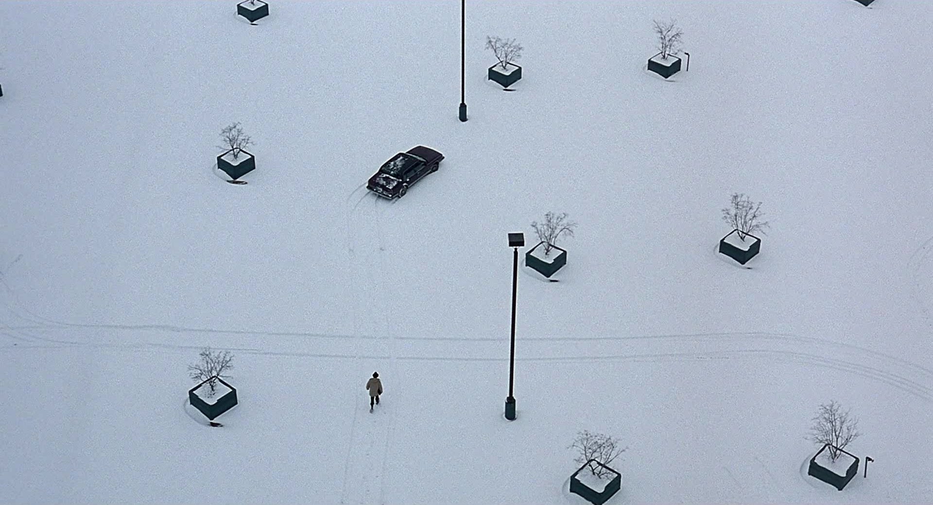
We also see a indistinct boundaries of one color into another here. The underlying image has few distinct lines—the entire image is ink drawn onto a wispy mist. What about when we get distinct lines and contrast? The easy answer for clean lines would have been to go to Wes Anderson here, but I felt like that was too expected from a blog post written by somebody such as myself. So instead, I took colors from the animated Lion King, a vibrant film, and projected it onto one of Roger Deakins’ best shots from Fargo.

set.seed(1839)

pal4 <- get_palette("lionking.jpeg", k = 2, mdn = TRUE)
plot4 <- make_plot("fargo.jpeg", pal = rev(pal4), xy = FALSE)

ggsave(
  "fargo_k2.png", 
  plot4$plot, 
  width = plot4$dims[1],
  height = plot4$dims[2],
  units = "px"
)

The last thing I wanted to do was look at a shot that had two primary colors and project it onto a black-and-white film, replacing that underlying dichotomy with two other colors.

set.seed(1839)

pal5 <- get_palette("killbill.jpeg", k = 2, mdn = TRUE)
plot5 <- make_plot("strangelove.jpeg", pal = pal5, xy = FALSE)

ggsave(
  "strangelove_k2.png", 
  plot5$plot, 
  width = plot5$dims[1],
  height = plot5$dims[2],
  units = "px"
)

The first shot below from Kill Bill Vol. 1 came to mind for a shot that was mostly two colors, while I went with my favorite scene from Dr. Strangelove, perhaps the funniest film ever made, for the black-and-white still:

The functions are above and the full code is at my GitHub. Try playing with the functions and blending images; it’s fun, but it also a visual guide that helps you truly understand what exactly k-means clustering is doing.

Why and How to Model Conditional Variance, with an Application to My Letterboxd Data

One of the main assumptions of linear regression taught in statistics courses is that of “constant variance” or “homoscedasticity.” Having data that do not have constant variance (i.e., are heteroscedastic) is then often treated as a problem—a nuisance that violates our assumptions and, among other things, produces inaccurate p-values. But I have been interested for some time in taking a different approach. Instead of seeing this non-constant variance as a nuisance that we need to adjust for, what if we saw it as part of the actual phenomenon of interest? That is, what if the changing variance is actually telling us something important about what we are studying? In this post, I’m going to describe a situation where predicted variance is meaningful for inferences we are trying to make, how to model it, and how it differs from ordinary least squares (OLS) regression. All the code and data need to reproduce this blog post can be found at my GitHub.

The Motivating Example

The use case here are my Letterboxd ratings. Letterboxd is an app that I use to log the films I’ve watched: It keeps track of when I watched a film, how I rated it (0.5 to 5.0 stars), and any text review I gave it on that watch. I started doing this at the beginning of the pandemic, and I been watching a lot of movies throughout this time of social distancing. Letterboxd has an amazing feature that allows you to export your data as a .csv. It also exports the year in which the film was released.

This leads to an obvious research question: Do I think movies are getting better—or worse—over time? I start my bringing in my data and regressing rating on year:

library(tidyverse)
library(gamlss)

ratings <- read_csv("ratings.csv") %>% 
  janitor::clean_names()

ggplot(ratings, aes(x = year, y = rating)) +
  geom_count(color = "#2D2D2A", alpha = .8) +
  geom_smooth(
    method = "lm",
    formula = y ~ x,
    se = FALSE,
    size = 1.5,
    color = "#7D82B8"
  ) +
  theme_light() +
  labs(x = "Year", y = "Rating") +
  scale_x_continuous(breaks = seq(1930, 2020, by = 10)) +
  theme(text = element_text(size = 16))
eda-1.png
summary(lm(rating ~ year, ratings))
## 
## Call:
## lm(formula = rating ~ year, data = ratings)
## 
## Residuals:
##      Min       1Q   Median       3Q      Max 
## -2.79500 -0.66621  0.02612  0.78370  1.84810 
## 
## Coefficients:
##              Estimate Std. Error t value Pr(>|t|)    
## (Intercept) 17.598037   5.179044   3.398 0.000749 ***
## year        -0.007155   0.002590  -2.762 0.006014 ** 
## ---
## Signif. codes:  0 '***' 0.001 '**' 0.01 '*' 0.05 '.' 0.1 ' ' 1
## 
## Residual standard error: 1.081 on 391 degrees of freedom
## Multiple R-squared:  0.01914,    Adjusted R-squared:  0.01663 
## F-statistic: 7.629 on 1 and 391 DF,  p-value: 0.006014

We see a significant relationship such that, for every year that passes, we expect about a 0.1 decrease in rating. But the scatter plot shows we do not have a constant variance: As year increases, the spread of scores gets wider. This violates the assumption of homoscedasticity. The general advice I got when learning regression was to use some type of robust standard error estimator so that this heteroscedasticity wouldn’t change Type I or Type II error rates.

But doing that ignores the real story of the data here: Scores get more extreme as time goes on. I watch many movies as they are being released, so I am much less discriminating when it comes to current movies than older movies. I watch, say, Zack Snyder’s Justice League, which I very much did not like, but I’m not watching whatever the 1960 version of that was. This heteroscedasticity reflects a sampling bias, then: I am much less discriminating about watching a movie that comes out contemporaneously than I am when I go back to watch films from before I was born.

How do we capture this in our model? We cannot with OLS regression. Note that the summary above tells us a “residual standard error.” This is constant, but we know it is not given the scatter plot and the way that the films were sampled (i.e., chosen to be watched).

The Model

To take a step back: What about OLS regression assumes constant variance? My website doesn’t like me trying to use Greek letters—plus I try to stay away from them when I can—so I’ll write the model out in code instead. Assume we have a predictor x, regression coefficients b_0 (the intercept), b_1 (the first predictor), an outcome y, and the residual e. We generally write it as:

y_i = b_0 + b_1 * x_i + e_i    where    e ~ N(0, sigma)

The e ~ N(0, sigma) means that the errors are distributed normally with a mean of zero and a standard deviation of sigma. I include the _i as a subscript to note that the y, x, and e variables differ by individual. Note that sigma does not have a subscript: It is the same for every person. This is where the assumption of constant variance comes from. Another way to write this equation is by saying:

y_i ~ N(b_0 + b_1 * x_i, sigma)

Which means that everyone is assumed to come from a normal distribution with the mean that is their predicted value (b_0 + b_1 * x_i) and a standard deviation that we calculate (sigma). The R package that I will be using refers to that predicted value as mu, so y_i ~ N(mu_i, sigma). What we will do is expand the model to add a subscript of i to the sigma, indicating that each respondent has a different standard deviation, as well as mean: y_i ~ N(mu_i, sigma_i).

We already have a regression equation predicting mu—the mean of the response variable. What we can do is make another regression equation predicting sigma—the standard deviation of the response variable. The only snag here is that a standard deviation or variance cannot be negative. What we can do is apply the log link function to our regression equation, which is generalized linear model trick to make sure all the predicted values are non-negative. (You may be familiar with the log link function from generalized linear models like Poisson regression).

This updated model then comes:

y_i ~ N(b_0 + b_1 * x_i, exp(b_3 + b_4 * x_i))

The exp makes sure that all of our predicted values are above zero. This shows a model where we were using just one variable x (e.g., a film’s release year) to predict both the mean and the standard deviation. Note that the same variables or completely different variables can be used for these two submodels, which we’ll call the mu and sigma submodels, respectively.

Simulating the Model

I think simulating data is a helpful tool for understanding how models work, so I do that here. First, I simulate 100,000 cases for predictor variables x and z that follow uniform distributions from 0 to 1:

n <- 100000
set.seed(1839)
x <- runif(n)
z <- runif(n)

I then make the mu and sigma submodels. Note that I use exp() around the sigma submodel to reflect the log link function that the R package will be using. I then simulate responses from a normal distribution, given everyone’s mu and sigma. Note that every person has a different predicted mu and sigma, distinguishing it from OLS regression, where each person has a different mu but the sigma is the same for everyone (i.e., constant variance):

mu <- 0.5 + 2 * x
sigma <- exp(1.5 + 3 * z)
y <- rnorm(n, mu, sigma)

Now we can use the gamlss package to estimate the model. This package is incredibly flexible in that it allows for many different error distributions, and it lets you specify a submodel for each of the parameters that define these error distributions. For now, we are going to use the normal distribution, or NO() in this package. The first formula we supply is by default mu submodel, and then we specify the sigma.formula afterward. Note that we are predicting each from x and z. After fitting this, we pull out the coefficients from the two different submodels:

m0 <- gamlss(y ~ x + z, sigma.formula = ~ x + z, family = NO())
## GAMLSS-RS iteration 1: Global Deviance = 883354.8 
## GAMLSS-RS iteration 2: Global Deviance = 883350.8 
## GAMLSS-RS iteration 3: Global Deviance = 883350.8
round(coef(m0, "mu"), 1)
## (Intercept)           x           z 
##         0.5         2.0         0.1
round(coef(m0, "sigma"), 1)
## (Intercept)           x           z 
##         1.5         0.0         3.0

Note that we specified above the intercept for mu submodel to be 0.5 and the coefficient for x to be 2.0. We didn’t include z, implicitly saying that the coefficient should be zero. We see those numbers! (We are .1 off for the z coefficient, but that can be expected due to random sampling). Same goes for the sigma submodel: The intercept we set is at 1.5, and the coefficient for z is 3. We observe these, showing us that we understand the model. We can simulate fake data and recover those parameters. So let’s apply it to my Letterboxd data.

Back to the Letterboxd Data

So now let’s fit a gamlss model predicting both predicted mean of rating—and its standard deviation—from the year in which the film was released:

m1 <- gamlss(rating ~ year, ~ year, family = NO(), data = ratings)  
## GAMLSS-RS iteration 1: Global Deviance = 1162.715 
## GAMLSS-RS iteration 2: Global Deviance = 1162.656 
## GAMLSS-RS iteration 3: Global Deviance = 1162.656
summary(m1)
## ******************************************************************
## Family:  c("NO", "Normal") 
## 
## Call:  gamlss(formula = rating ~ year, sigma.formula = ~year,  
##     family = NO(), data = ratings) 
## 
## Fitting method: RS() 
## 
## ------------------------------------------------------------------
## Mu link function:  identity
## Mu Coefficients:
##              Estimate Std. Error t value Pr(>|t|)    
## (Intercept) 16.529525   4.432572   3.729 0.000221 ***
## year        -0.006620   0.002224  -2.976 0.003101 ** 
## ---
## Signif. codes:  0 '***' 0.001 '**' 0.01 '*' 0.05 '.' 0.1 ' ' 1
## 
## ------------------------------------------------------------------
## Sigma link function:  log
## Sigma Coefficients:
##               Estimate Std. Error t value Pr(>|t|)    
## (Intercept) -1.290e+01  9.239e-01  -13.97   <2e-16 ***
## year         6.485e-03  6.772e-05   95.75   <2e-16 ***
## ---
## Signif. codes:  0 '***' 0.001 '**' 0.01 '*' 0.05 '.' 0.1 ' ' 1
## 
## ------------------------------------------------------------------
## No. of observations in the fit:  393 
## Degrees of Freedom for the fit:  4
##       Residual Deg. of Freedom:  389 
##                       at cycle:  3 
##  
## Global Deviance:     1162.656 
##             AIC:     1170.656 
##             SBC:     1186.551 
## ******************************************************************

The first set of coefficients is for the mu submodel, or the mean. The second set is for the sigma submodel. We see that year is a significant predictor of each. The older the film release is, the higher the predicted average score, and the lower the predicted variance of that distribution is.

I think examining predicted values can help us understand this better, so I get the predicted mean and standard deviation for every year between 1934 (the year of the oldest movie I’ve watched) and 2021. Let’s look at the predicted values for 1940, 1970, 2000, and 2020:

plot_data <- data.frame(year = min(ratings$year):max(ratings$year))
# code is a little circuitous because predict.gamlss fails with new columns
pred_mu <- predict(m1, "mu", newdata = plot_data)
pred_sigma <- predict(m1, "sigma", newdata = plot_data, type = "response")
plot_data$mu <- pred_mu
plot_data$sigma <- pred_sigma

plot_data %>% 
  filter(year %in% c(1940, 1970, 2000, 2020)) %>% 
  mutate(across(where(is.double), round, 2))
##   year   mu sigma
## 1 1940 3.69  0.72
## 2 1970 3.49  0.88
## 3 2000 3.29  1.07
## 4 2020 3.16  1.22

For movies coming out in 1970, we’re predicting that they have about a 3.5 score on average, with a standard deviation of 0.88. For 2020, however, we are predicting that they have about a 3.2 average score with a standard deviation of 1.22.

This model captures the real story of the data: Scores are more varied as time goes on, due to how I select which movies to watch. The sigma submodel allows us to make inferences about these relationships, which might be phenomenon of interest to researchers and analysts.

We can also plot the predicted mean as well as a standard deviation above and below this mean. This shows how the spread increases as time goes on:

ggplot(plot_data, aes(x = year, y = mu)) +
  geom_count(
    data = ratings,
    mapping = aes(x = year, y = rating),
    color = "#2D2D2A",
    alpha = .8
  ) +
  geom_line(size = 1.5, color = "#7D82B8") +
  geom_line(aes(y = mu + sigma), linetype = 2, color = "#7D82B8", size = 1.2) +
  geom_line(aes(y = mu - sigma), linetype = 2, color = "#7D82B8", size = 1.2) +
  theme_light() +
  labs(x = "Year", y = "Rating") +
  scale_x_continuous(breaks = seq(1930, 2020, by = 10)) +
  theme(text = element_text(size = 16)) +
  ylim(c(0.5, 5))
plotting_preds-1.png

Conclusion

We’re often taught to think about modeling and predicting average values. However, a lot of important social phenomenon deal with variance. For example, if there is a strict social norm about a topic, we might expect smaller variance than when there are weak norms about a topic. Or we might observe that people who highly identify with a group that has that norm have a smaller variance than those who are weakly identified with that group. I urge folks to think about situations where modeling variance of responses—the spread of the data—might be just as or more important than averages. The gamlss package provides a user-friendly interface to fit and draw inferences from these models.